A Strategic Guide for Beauty Brands & Wholesale Buyers — by Beaut-lohas.com
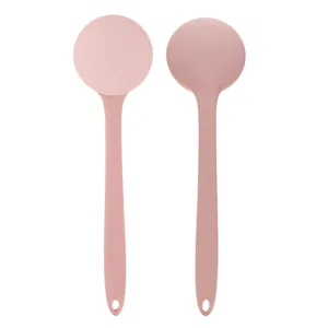
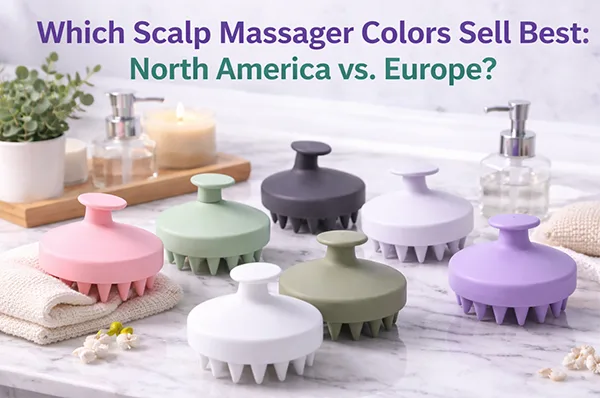
The global beauty and personal care market considers product design to serve two purposes because it operates as a functional element and displays visual design. The color of scalp massagers, which people use as hair care accessories, determines most of their buying choices. Buyers from different regions select particular color palettes because they are influenced by their cultural background and aesthetic taste and their daily activities.
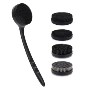
At Beaut-lohas.com — a leading silicone scalp massager OEM/ODM manufacturer and private-label supplier — we analyze sales data, retail feedback, and regional market behavior to identify how color choices impact scalp massager sales in North America vs. Europe. Brands use these trends to create better product strategies because they provide evidence which helps eliminate excess inventory while making products more attractive to customers.
In this article, we explore:
Why color matters for scalp massager products
Top performing colors in North America
Best selling shades in major European markets
How to choose the right palette for your brand
Customization strategies for global appeal
Why Color Matters in Scalp Massager Sales
Color selection influences purchasing behavior in a surprisingly significant way. For scalp massagers — often featured in social media, bathrooms, and gift sets — appealing colors can:
• Attract attention in crowded e-commerce listings
In thumbnails where size is small, color helps products stand out visually.
• Support lifestyle positioning
Colors help signal whether a product is premium, playful, minimalist, or wellness-oriented.
• Influence emotional response
Consumers associate colors with feelings — calm, luxury, nature, energy, or simplicity.
• Align with broader home and beauty product color trends
Modern consumers consider coordinated aesthetics (e.g., matching bathroom accessories).
From a wholesale and private-label perspective, understanding these color preferences improves:
Conversion rates
Customer satisfaction
Repeat orders
Brand perception
Color Trends in North America
North American consumers — especially in the U.S. and Canada — show clear preferences that reflect broader lifestyle aesthetics:
1. Neutral and Minimalist Tones — White, Black, Gray
Neutral colors continue to dominate because they:
Fit seamlessly in any bathroom or vanity setting
Appeal to minimalists prioritizing simplicity
Signal “classic and universal” appeal
These shades perform especially well in:
Large online retailers (Amazon, Walmart)
Multi-brand beauty stores
Subscription bundles
White and black scalp massagers are widely perceived as “professional” and “timeless” — especially when offered alongside premium packaging.
2. Pastel Hues — Blush Pink, Mint Green, Dusty Blue
Pastel tones have been rising due to social media influence and lifestyle aesthetics. Pastels are associated with:
Calmness and self-care
“Instagram-worthy” visuals
Compatibility with skincare product collections
Blush pink and mint green are frequently chosen for:
Gift sets
Female-skewing brands
Wellness-focused campaigns
These colors often lead to higher engagement on visual platforms like Instagram and TikTok.
3. Earthy and Spa-Inspired Shades — Taupe, Sage, Sand
Wellness and spa aesthetics have influenced the trend toward:
Sage green
Sand beige
Earth neutrals
North American buyers, especially in wellness and salon markets, respond well to these spa and nature cues, which hint at relaxation and self-care.
4. Metallic Accents and Premium Finishes
For electric or premium silicone scalp massagers, metallic accents in:
Rose gold
Champagne
Matte gold trims
add perceived value, affording them a higher MSRP.
These finishes are often bundled in gift packaging around holidays and special occasions.
Color Trends in the European Market
European consumers — from the UK and Germany to Scandinavia and Southern Europe — show overlapping yet distinct preferences compared to North America.
1. Classic Minimalism — Slate Gray, Charcoal, White
Much like North America, Europe favors neutral simplicity, especially in:
Urban markets (London, Berlin, Amsterdam)
Scandinavian countries
Slate gray and charcoal often outperform pure black because they feel more modern and design-oriented rather than stark.
White remains a staple due to its clean and fresh aesthetic.
2. Muted Naturals — Olive, Mauve, Terracotta
Europe’s design culture — heavily influenced by interior trends — tends to embrace:
Muted earth tones
Soft natural palettes
Olive, terracotta, and mauve are seen as more refined and artistic, especially among mid-to-high end consumers.
These colors pair well with minimalist branding and premium skincare assortments.
3. Deep Jewel Tones — Emerald, Deep Blue, Burgundy
In markets such as the UK, France, and parts of Southern Europe, rich jewel tones are trending due to:
Luxury brand influence
Mature consumer segments
Boutique salons and premium retailers
These deeper hues are often associated with luxury, depth, and sophistication.
4. Subtle Pastels — Lavender, Powder Blue
While Europe embraces minimalism, certain pastel tones crossover from wellness and beauty trends.
Lavender and powder blue are popular for:
Calm, spa-like aesthetics
Inclusive gender appeal
Coordinated bath accessory collections
Europe’s interest in subtle pastels lies in soft emotion and timeless style, rather than the bold or playful tones seen elsewhere.
Comparing North America and Europe: Key Takeaways
| Aspect | North America | Europe |
|---|---|---|
| Classic Neutrals | ✔️ High Demand | ✔️ High Demand |
| Pastel Hues | ✔️ Popular | ✔️ Moderately Popular |
| Earthy Spa Tones | ✔️ Increasing Trend | ✔️ Strong Trend |
| Muted Naturals | ✔️ Emerging | ✔️ Strong |
| Deep Jewel Tones | ✔️ Selective | ✔️ Strong Among Premium |
| Metallic/ Premium Accents | ✔️ High Interest | ✔️ Moderate Interest |
Color Psychology in Purchase Behavior
Consumers don’t just choose colors based on aesthetics — they choose based on:
Lifestyle identity
Perceived positioning (budget vs premium)
Compatibility with daily routines
Emotional appeal (calm, energy, luxury)
For example:
Pastels are often associated with self-care and wellness aesthetics
Earthy tones communicate natural, spa-inspired luxury
Neutrals emphasize professionalism and universality
Jewel tones elevate premium brand positioning
When brands align color with emotional cues, conversion rates tend to increase.
Regional Distribution Insights from Beaut-lohas.com
As a wholesale silicone scalp massager manufacturer with clients across North America and Europe, beaut-lohas.com has observed:
• North American clients often focus on:
Neutrals (White, Black, Gray)
Pastels (Mint, Blush, Powder)
Spa neutrals (Sand, Sage)
Limited edition seasonal tones
• European clients emphasize:
Muted earth tones (Olive, Terracotta, Taupe)
Minimalist neutrals (Slate, Charcoal)
Select jewel tones for premium lines
Subtle pastels that align with timeless aesthetics
These patterns influence how retailers bundle products, design listings, and create cross-sell strategies.
How to Customize and Segment Color for Your Brand
If your brand sells in multiple regions, consider:
1. Multi-SKU Color Strategy
Create distinct SKUs for:
North American shoppers
European design sensibilities
Global aesthetic bundles
This reduces inventory risk while maximizing appeal.
2. Regional Best-Seller Launch Packs
Test a launch pack with:
White & Slate Gray (core universally accepted)
Mint & Blush (North America)
Olive & Terracotta (Europe)
Monitor early sales to optimize reorder planning.
3. Seasonal and Limited Edition Colors
Seasonal color collections (e.g., Spring Pastels, Autumn Earth) stimulate:
Renewed consumer interest
Gift purchases
High-value bundles
Pastel palettes often do well in spring/summer; earthy tones in fall/winter.
4. Packaging That Reinforces Color Messaging
Pair color palettes with packaging:
Kraft + Earth tones for sustainable positioning
Matte boxes with jewel accents for premium lines
Pastel minimalist designs for wellness
Conclusion: Color Strategy Drives Scalp Massager Sales
The process of choosing colors has become a vital component of scalp massager sales strategies. North American consumers prefer neutral colors and calming pastel shades, while European consumers show a growing preference for subdued natural colors and elegant neutral shades that include selected high-end gemstone colors.
The product’s market success will develop through hardware buyers and private-label brands who use their regional color preferences to match their branding elements with product colors.
At beaut-lohas.com, we support:
Custom color matching (Pantone)
Private-label color variations
Regional SKU strategies
Retail packaging design
Compliance for global distribution
Whether you sell in the US, EU, or both, refining your color portfolio can unlock higher conversions and stronger brand resonance.