A Strategic Color Trend Guide for Beauty Brands & Wholesale Buyers — Beaut-lohas.com
Color is not merely an issue of design but also an important factor in consumer perception and brand identification. In the current competitive environment for beauty accessories, scalp massagers are no different. Whether they are listed online or in physical retail stores, color is an important factor in helping these products differentiate themselves in quality and region-specific consumer tastes.
For brands, distributors, and private label providers who are working with Beaut-lohas.com, a professional manufacturer of silicone scalp massagers, understanding consumer color preferences in regions like North America and Europe can be an important factor in optimizing product offerings and developing consumer-centric marketing campaigns.
In this article, we look at what color preferences are in different regions for scalp massagers, why these preferences are important, and how they can be used to target different consumer segments.
Why Color Matters in the Scalp Massager Market
Before delving into specific regional trends, it’s important to understand why color influences purchase decisions:
1. Emotional and Psychological Impact
Colors can evoke different emotions in users, such as comfort, cleanliness, luxury, energy, and serenity. The color of a product can impact users’ emotional connections with using the product.
2. Aesthetic Compatibility with Home Decor
Unlike most beauty product accessories that are confined to cabinets, scalp massagers are frequently positioned in bathroom and vanity areas. Therefore, colors that are compatible with existing decor create more appealing product offerings.
3. Brand Identity and Positioning
A brand’s color scheme can play an important role in defining its brand identity and positioning.
4. Visual Performance on Digital Platforms
For Amazon and Shopify platforms, product thumbnails compete with one another to achieve more click-throughs. Contrasting colors with high quality are more effective in driving more user interactions.
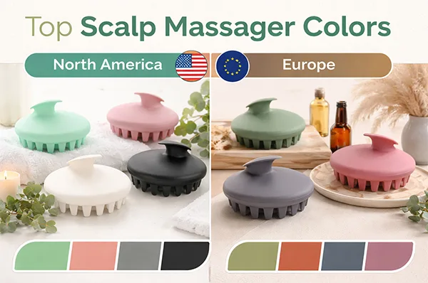
Color Preferences in North America
North American consumers — particularly in the U.S. and Canada — generally lean toward colors that evoke simplicity, versatility, and soft lifestyle aesthetics.
1. Classic Neutrals: White, Black, Gray
Neutral colors have continued their dominance as the best performers for scalp massagers in North America:
- White Symbolizes purity and versatility
- Black Symbolizes luxury and longevity
- Gray Symbolizes contemporary minimalism
All three colors are common in bathrooms, making them easy choices for the masses.
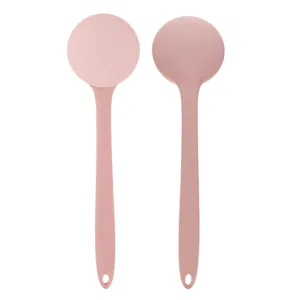
2. Pastel Colors: Mint, Blush, Lavender
Pastel colors have seen a significant rise due to the impact of social media and the popularity of minimalistic brands that focus on wellness.
- Mint green is invigorating
- Blush pink is soft and friendly
- Lavender is nurturing
This combination of colors is seen to work well for female audiences.
3. Earthy Tones: Taupe, Sand, Sage
In response to the eco-wellness trend, consumers are increasingly selecting earthy tones that convey a sense of organic and relaxing qualities. These earthy tones help to ensure that products align well with the eco-wellness theme.
4. Metallic Accents for Premium Lines
For high‑end scalp massagers — particularly electric or dual‑function designs — metallic accents like:
- Rose gold
- Champagne
- Matte copper
These colors help elevate perceived value and support premium retail positioning.
Color Preferences in Europe
The design and fashion heritage of Europe influences distinct color preferences. Consumers in the UK, Scandinavia, Germany, and Southern Europe tend to have a preference for sophisticated, understated, and design-driven colors.
1. Minimalist Neutrals: Slate, Charcoal, Ivory
In Europe, consumers may lean toward deeper, cooler neutrals such as:
- Slate gray for sophistication
- Charcoal for timelessness
- Ivory for a softer, warmer alternative to white
Especially, these colors will be suitable for brands that focus on understated elegance and durability.
2. Muted Naturals: Olive, Terracotta, Mauve
The European design style tends to incorporate various earthy tones.
- Olive reflects organic appeal
- Terracotta evokes artisanal charm
- Mauve brings a touch of artistic appeal
The colors will be especially appealing to design-centric countries like Scandinavia and the Netherlands.
3. Deep Jewel Tones for Premium Audiences
For premium and boutique brands, deeper tones have significant appeal:
- Emerald green
- Deep navy blue
- Burgundy
These colors convey a sense of luxury, depth, and sophistication.
4. Soft Pastels with a Mature Twist
While pastels are popular across the globe, Europeans prefer softness with subtlety. They prefer muted pastels rather than bold ones.
Popular pastels include:
- Powder blue
- Dusty rose
- Lilac gray
Regional Comparison: Key Takeaways
| Category | North America | Europe |
|---|---|---|
| Core Neutrals | White, Black, Gray | Slate, Charcoal, Ivory |
| Pastels | Bright pastels popular | Muted soft pastels |
| Earthy Tones | Emerging trend | Strong preference |
| Premium Finishes | Metallic accents appealing | Deep jewel tones preferred |
| Design Orientation | Functional + lifestyle | Elegant + design‑driven |
Consumer Psychology Behind the Preferences
North America: Lifestyle & Wellness
For North American consumers, product colors can be part of an overall lifestyle and wellness strategy. Soothing colors associated with self-care and flexibility are popular.
Europe: Design & Timeless Aesthetics
For European consumers, particularly those in Scandinavian countries, Germany, and the UK, which are particularly design-centric, colors that are slightly refined and sophisticated are popular. They tend to avoid colors that are trendy.
The colors are in line with what can be considered an overarching trend in interior design and fashion in those parts of the world.
How Brands Can Use Color Strategically
1. Tailor Regional SKUs
Instead of having one single palette across the board, brands can develop region-specific SKUs:
- North America: Neutral + pastel Mix
- Europe: Muted Naturals + Deep Neutrals
This helps mitigate inventory risk.
2. Leverage Seasonal Releases
Seasonal releases maintain the buzz for brands:
- Spring: Pastels + Earth Tones
- Autumn: Neutrals + Jewel Tones
- Holidays: Metallics + Limited Editions
Such regular releases also facilitate the creation of predictable buzz.
3. Coordinate with Packaging
Ensuring that the packaging of the product matches the color of the product will provide a premium experience to customers. For example:
- Brush: Sage green
- Packaging: Kraft box
- Brush: Slate gray
- Packaging: White box
This will result in higher conversion rates.
4. Leverage Social & Influencer Styling
Products that look good in photographs, especially in a lifestyle setting, have a higher chance of succeeding in social media. The use of colors that look good in thumbnails, reels, and lifestyle settings can boost engagement.
Color Customization with Beaut-lohas.com
As a professional manufacturer of silicone scalp massagers, we also provide OEM/ODM service. We can provide full-color customization:
- Pantone color matching
- Multi‑color production
- Printing of logo and texture
- Eco-packaging according to the color theme
Beaut-lohas.com can help you reach the North American, European, or global market, and optimize the colors of your products.
Future Color Trends to Watch
- Soft Neutrals with Matte Finish
- Translucent Silicone with Layered Tones
- Two-Tone Designs Featuring Wellness and Premium Cues
- Nature-Inspired Color Themes Linked to Sustainability Messages
All of these color trends are related to beauty and home accessories.
Conclusion
Color is an important element in the design of scalp massagers, and it is not just limited to visual appeal. For consumers in North America, bold minimalism and soothing pastels are popular, while Europeans prefer sophisticated neutrals and soft earthy shades.
For brands and wholesalers, this knowledge translates to greater conversion, branding, and customer loyalty.
At Beaut-lohas.com, our expertise in design and manufacturing enables us to help brands create regionally relevant scalp massagers that are not just visually appealing but also functional in different markets.